A Welcome Return to the Fashion Clash
Review of Marni Fall 2026 Fashion Show
By Angela Baidoo
Meryll Rogge’s design background working as head of Women’s design for Dries Van Noten and as an assistant at Marc Jacobs that extended into a seven-year stint sharpened (or softened depending on how you look at it) the designers eye for a sartorial clash – whether colour, pattern, or texture. Launching her eponymous brand in 2020, in 2025 she picked up the ANDAM grand prize only a month before she was announced as the new creative director of Marni – succeeding Francesco Risso.
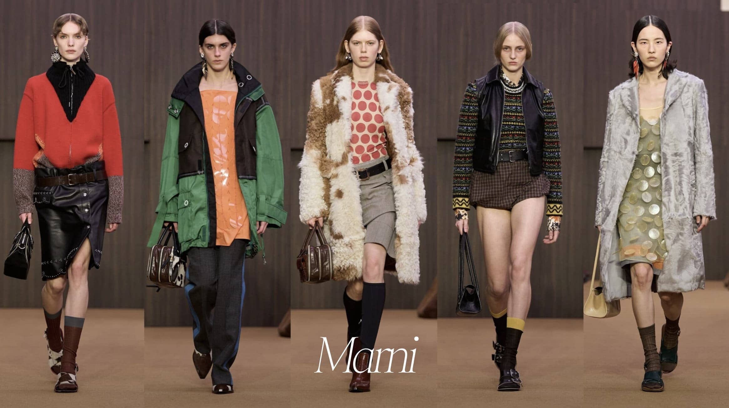
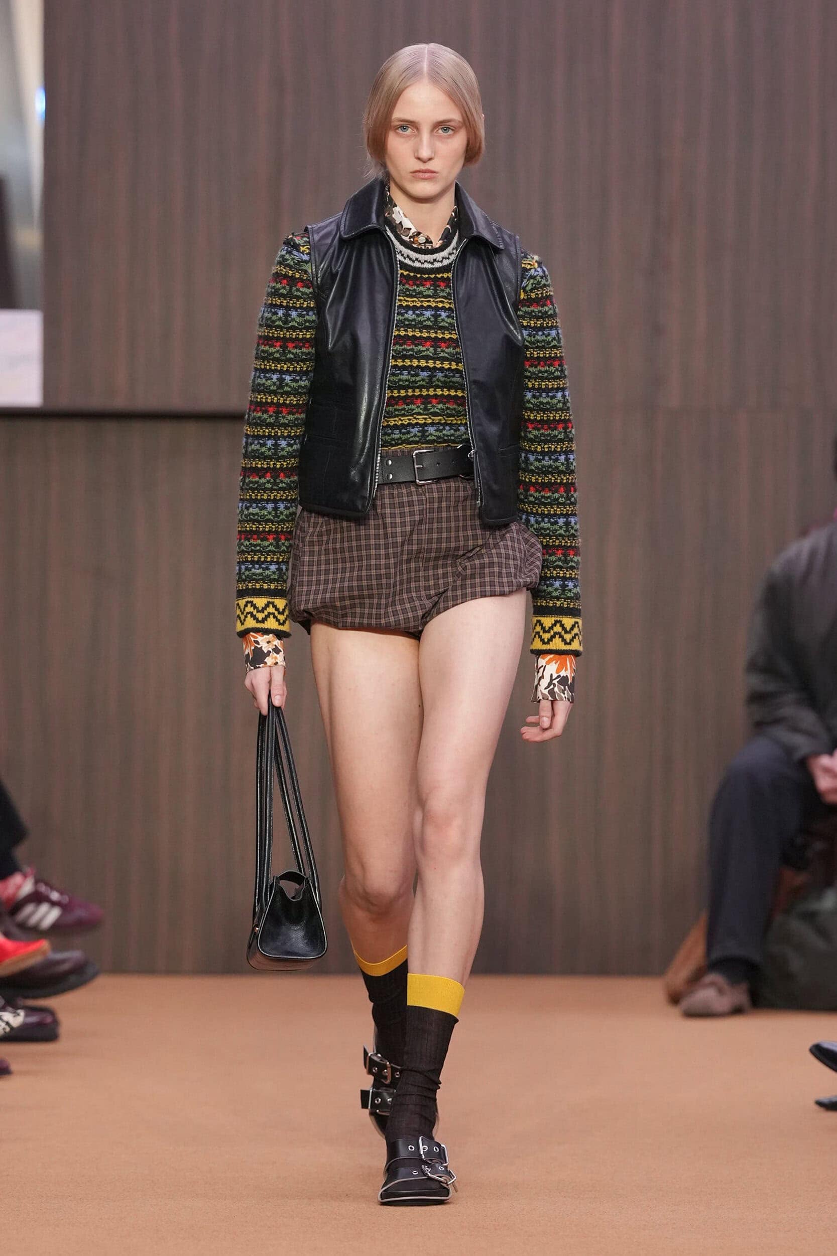
A significant move by OTB Group owner Renzo Rosso, who was sitting front row at Rogge’s debut, the designer becomes part of a very small group of women designers, designing for women (and men in many cases). And as with Diesel at the beginning of the week, she brought back a sense of fun and abandonment to the start of her tenure. The clash of colour and the mix of fabrics, the chunky jacquard knits, the playful mini shorts, and the extreme embellishment all felt as if we are being given permission to once again make our style or own, and refrain from following the crowd. We don’t need to be brave to break away as much of what the designer presented today would work just as well as separates, as they would a full look, but where’s the fun in that!
THE COLLECTION
THE VIBE
Necessary Expression, Reshaped Reality, Eye-pleasingly Eclectic
A not-so-familiar name outside of the industry circuit, Meryll Rogge’s designs for her namesake independent label were sought after, nonetheless. A bold, distinctive style characterised by off-beat colour combinations, purposeful pattern disruption and disproportionate silhouettes defined her work.
Not every creative director appointed to lead a house can boast of encountering said house in their early years. Saving up for a coveted bag or pair of shoes – when both those items were at price points still accessible to the average consumer. Yet, this was Rogge’s experience with Marni, with whom she spent an entire paycheck on a pair of wooden sandals. This early attachment to the brand – and now full circle moment as she gets to take the reins – inevitably shaped her design outlook which can be seen in the way she distorts her silhouettes, layers together unexpected items and clashes patterns.
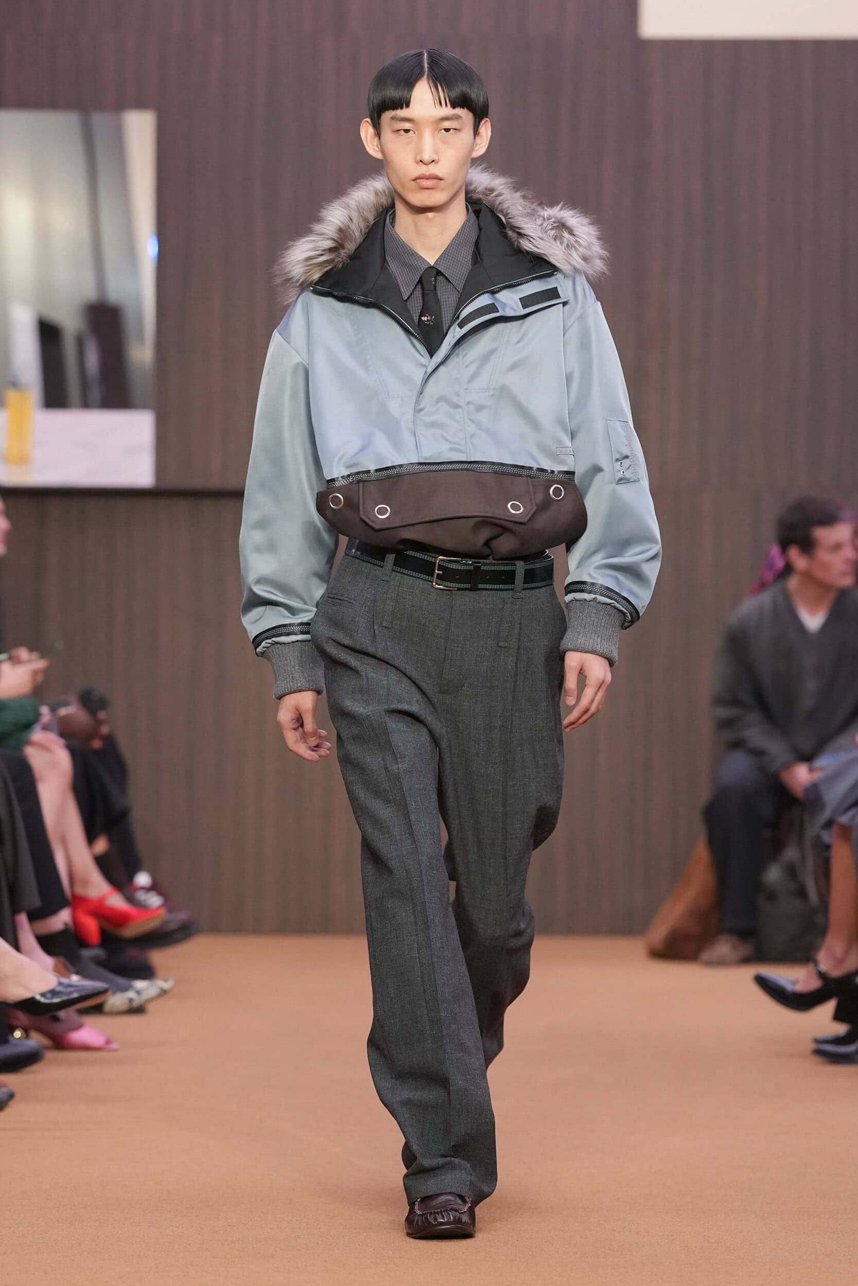
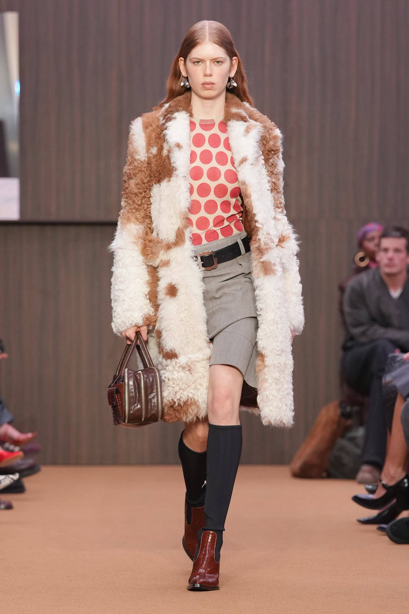
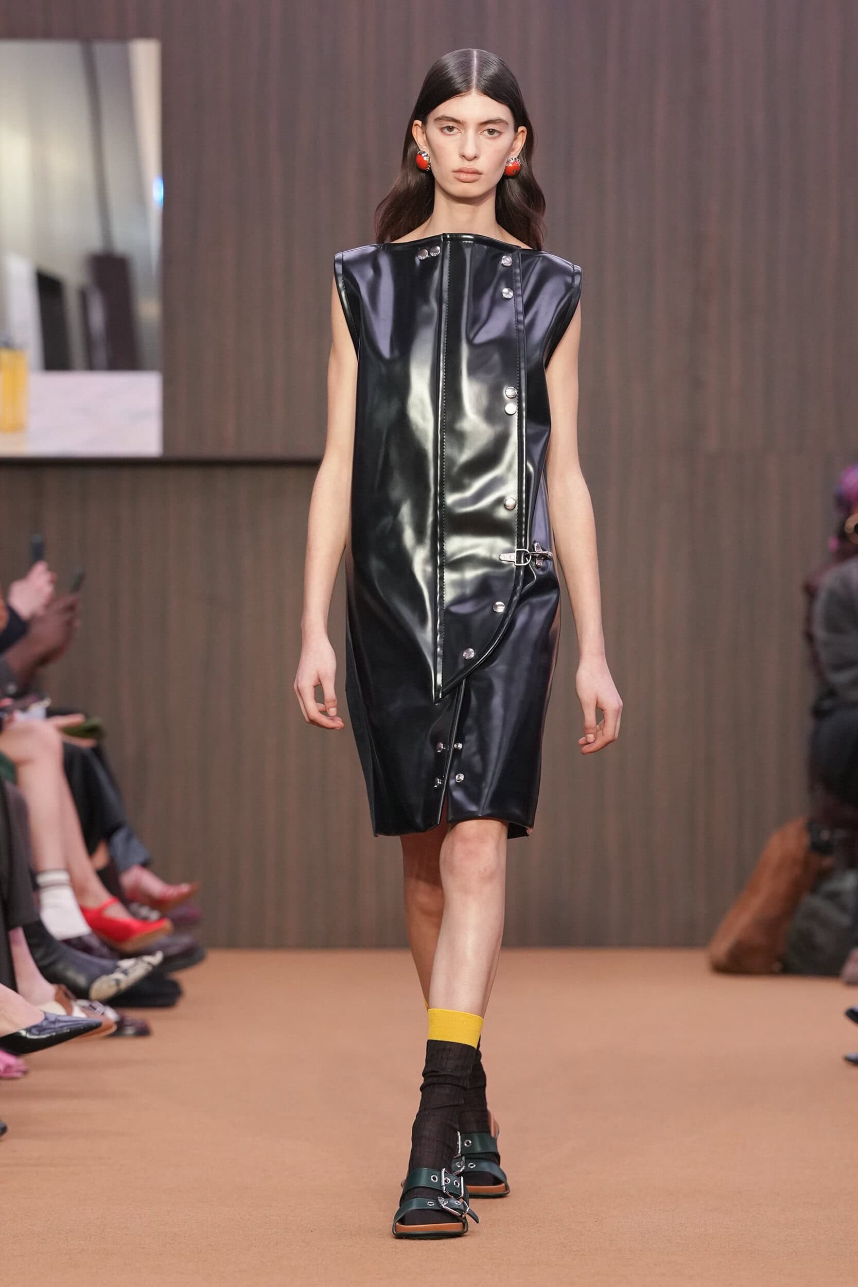
Tapping into what were some of the brands best years, Rogge decided to go back to the beginning and open her debut with a surprisingly muted palette – found when reviewing the archives and some of the brands early collections (on a hard drive no less!!) they were devoid of colour and print, just a simple palette of brown, black, white, and grey. So, this start for the brand was also reflected in this new chapter. Speaking backstage post-show she explained to The Impression “Getting back to, let’s say, the origins of the brand, we looked at some of the very first collections that are not to be found online. Actually, we found them on a hard drive in the office, and the first three collections, the colour palette was brown, black, white and grey, and there was no print, and there was no colour, which was very surprising to us. We really didn’t believe it. And then the first colour comes in in a very little red floral print in 95 and so that’s why the first look of the show has this colour palette, because we really wanted to start from the roots.”
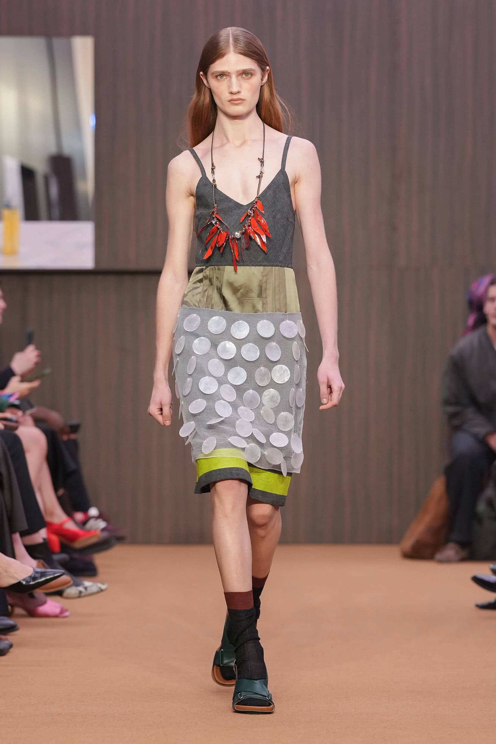
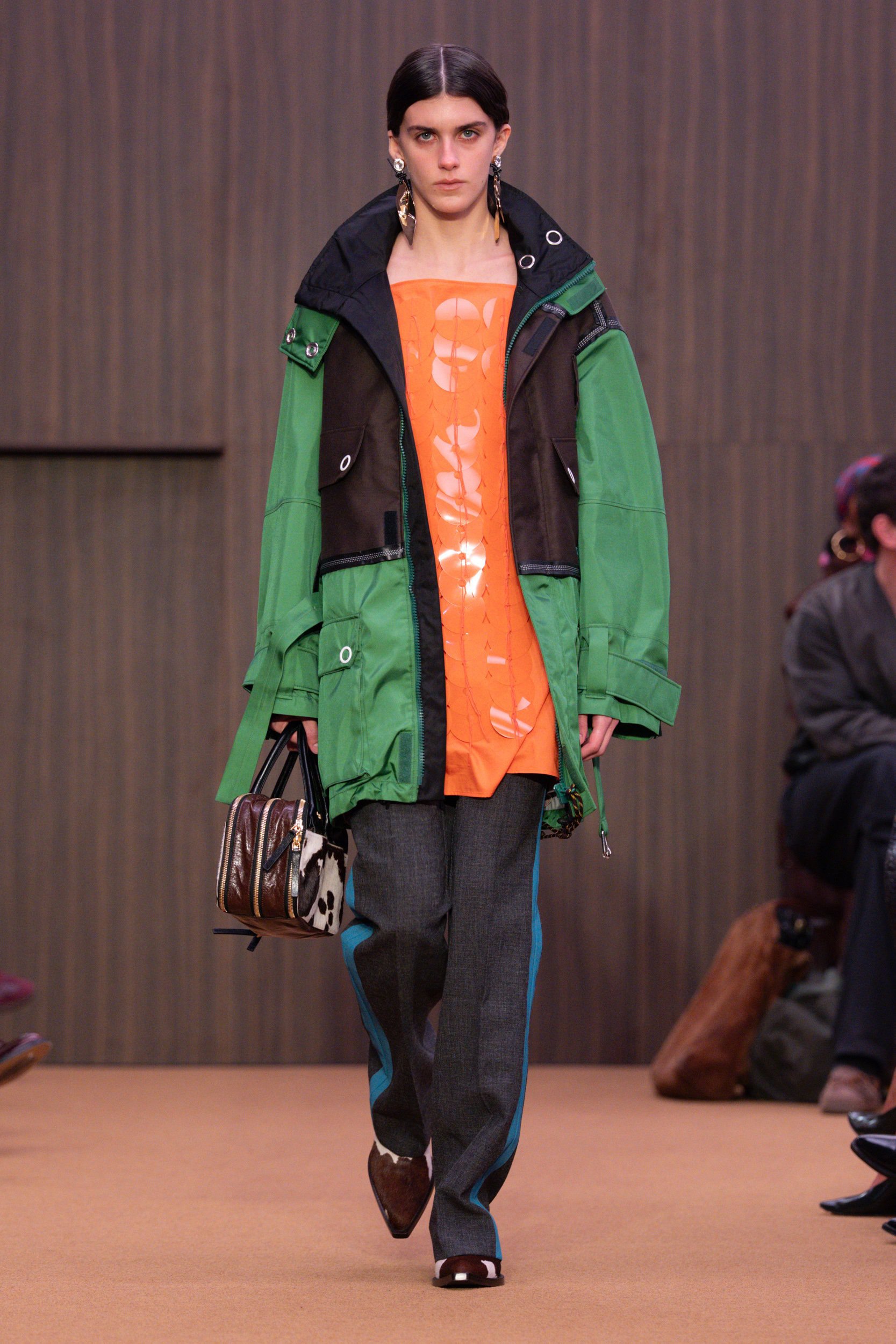
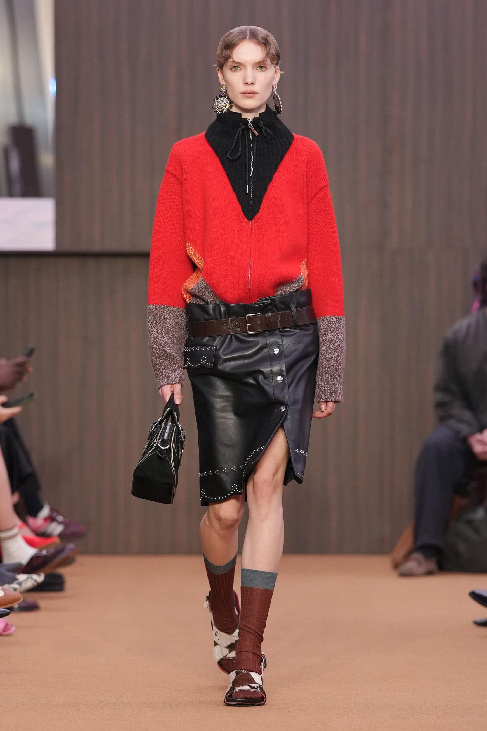
For the many Marni fans there must have been a collective intake of breath as they wondered whether they would be compensated with colour further into the collection, and they were not to be disappointed. With colour coming in as the collection progressed Rogge wanted those who love Marni to feel reassured that she is fully versed in the brand’s DNA. Rather than re-hashing ideas of old she was seeking to capture the spirit of founder Consuelo Castiglioni’s Marni and repackage it for a new generation. Especially as the essence of the brand and its eclectic mashing up of fabric, themes, and palettes helped its wearers stand out as more intellectually minded when it came to their fashion choices. Now there is such a wholesale acceptance of maximalist styling that it won’t take much to convince the next generation to buy into her Marni era. Chiefly because the homogenisation seen on the runways over the last two years has meant the industry has been crying out for a disruptor with reach to shake things up. As the designer spoke to, when it comes to the younger generation, she wants them to feel called to the brand as well.
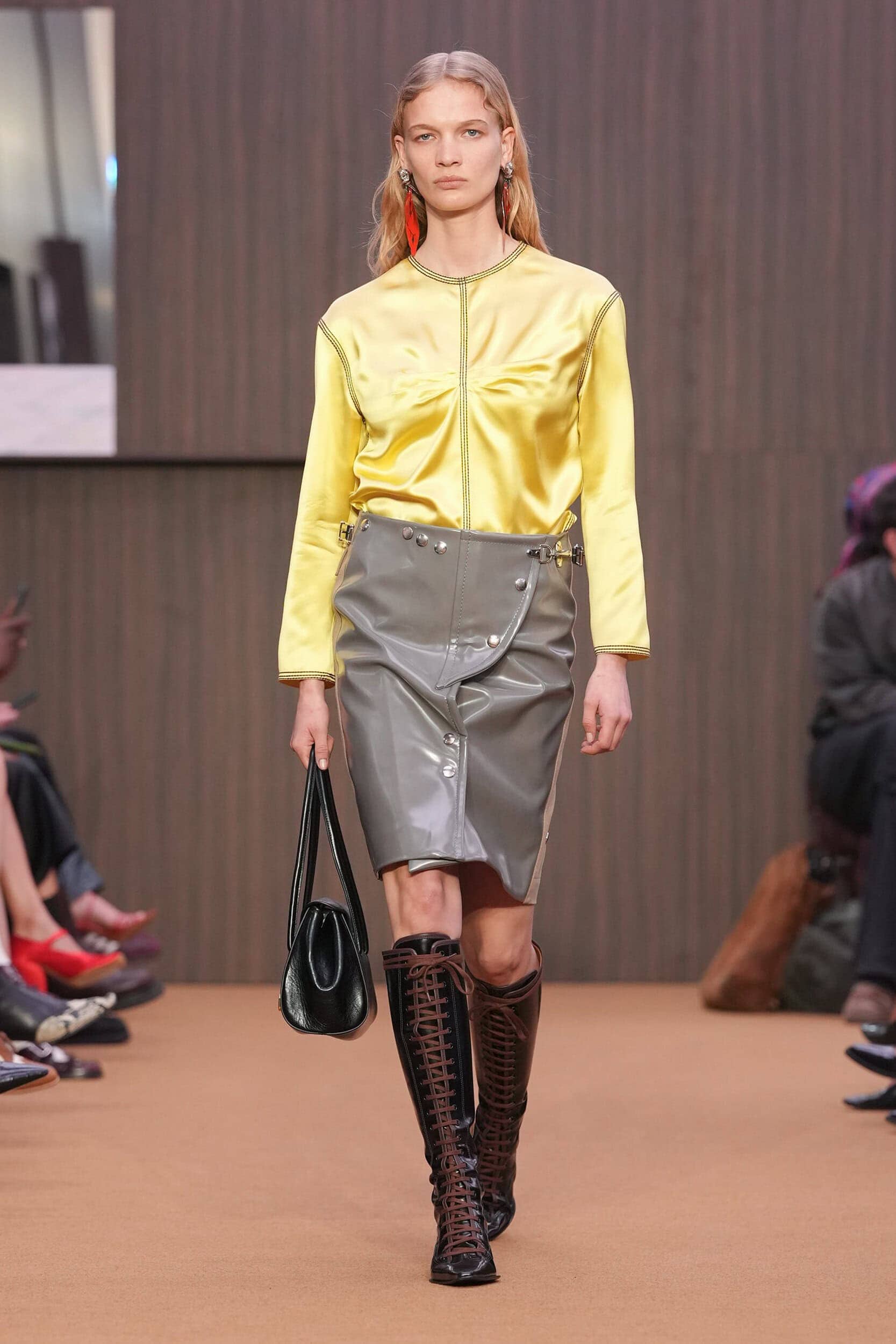
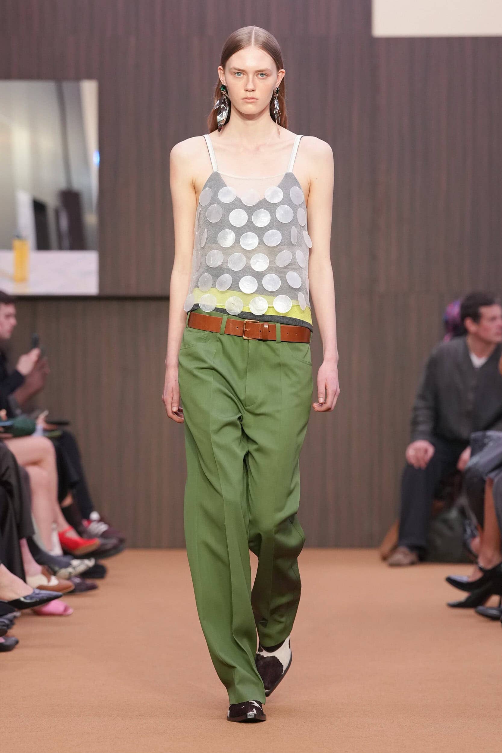
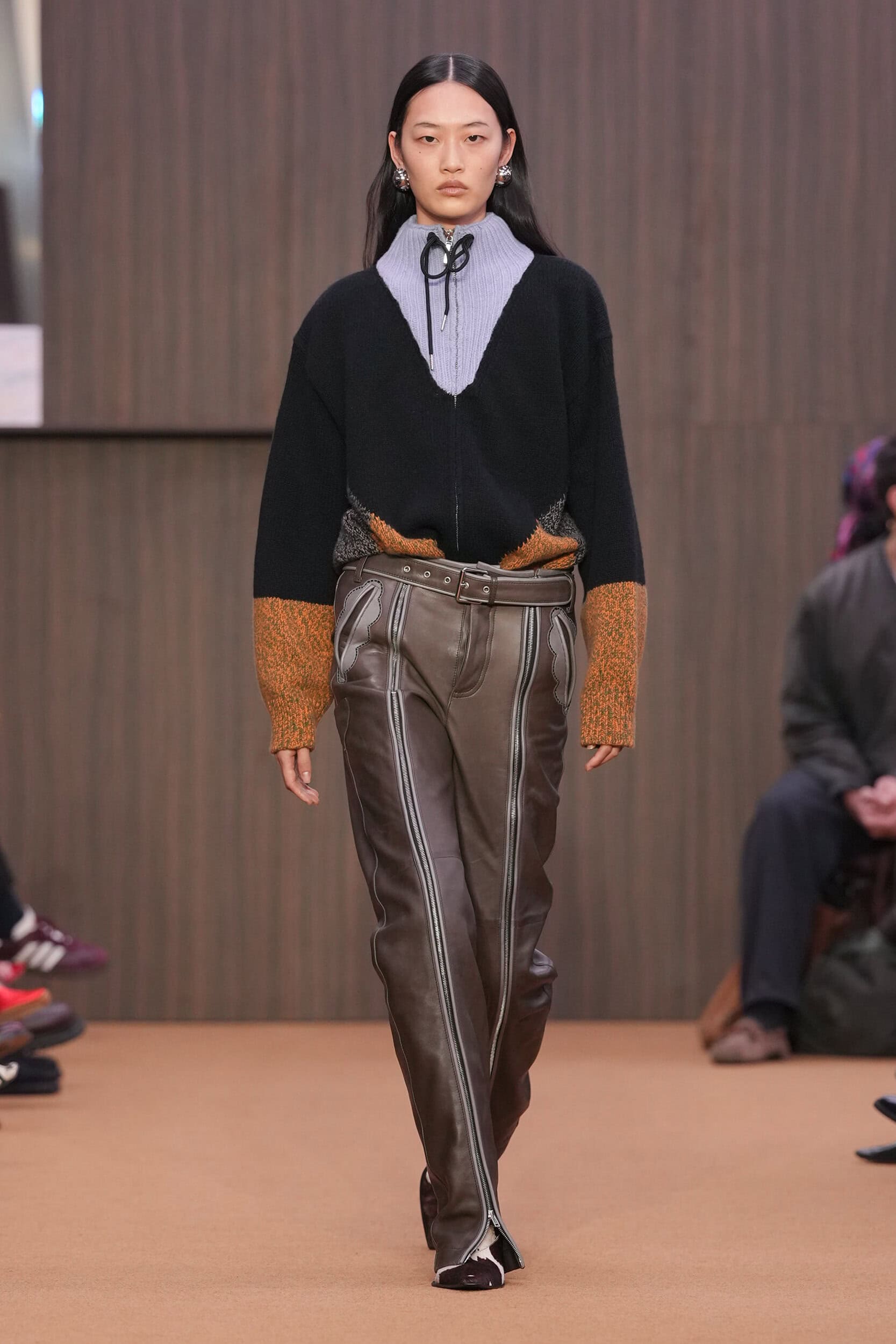
When probed by The Impression, the newly appointed creative director didn’t hesitate to confirm that the key concerns she will be focussing on at the start of her tenure would be humble materials – a coat made from goat is in contrast lined in cotton! – and hints at archival references over literal translations for the, as she put it, “old guard” who will recognise the stencil floral print on a sheer pencil skirt. It was also important to keep the Marni spirit alive, in retaining that “bold elegance.”
Though the brand may seem for the intellectual fashion collector, and anyone else who can effortlessly style a glossy cobalt blue cobalt coat for a trip to the supermarket without being labelled a fashion victim, this is a preconception that the designer wants to change by giving it a broader appeal. She explained “[Marni is] for the wider audience, and what I mean by that is that it appeals also, or at least it did, to people who are interested in culture, interested in the arts. It’s broader than just passion for me.”
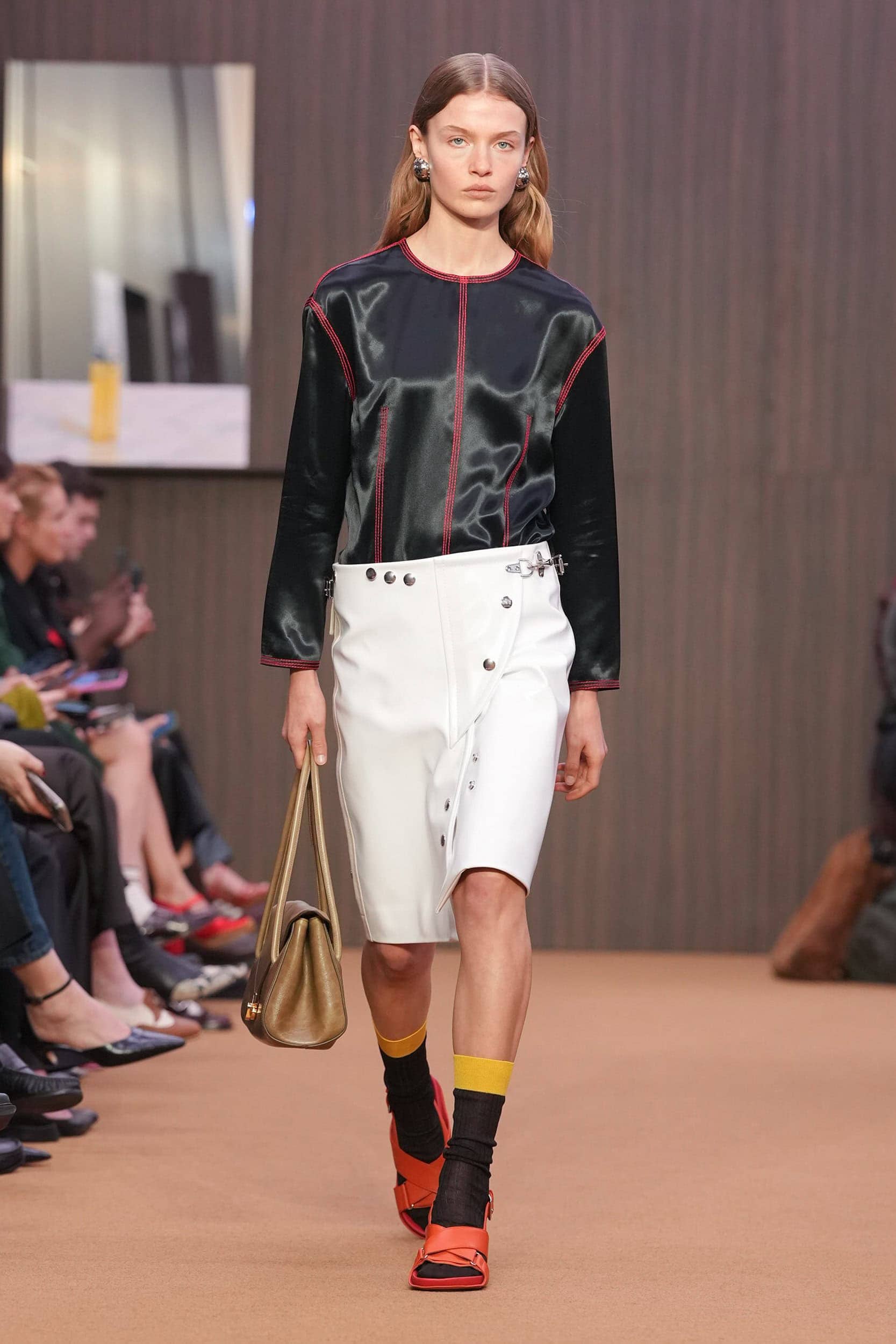
The collection itself took its aesthetic from that pivotal period of change, when the 90s were coming to an end and we were all looking ahead (with some trepidation I might add) to a futuristic sounding 2000. Revamping the long and lean silhouettes that encompassed striped fitted button downs, midi pencil skirts, and satin everything. Rogge’s combined a mix of fabric, techniques, and textures to great effect, bringing back the circular patterns closely associated with the brand, for fall they became oversized jangly paillettes that will be the most fun to wear heading into next winter and a joyful indictment that Marni is back.
THE QUOTE
It’s a wonderful team at Marni, and it’s bigger than my own personal brand. Generally, Italy is the place to be to make clothes. I mean, it’s just wonderful. The savoir faire, the know-how – from fabrics to manufacturing to trims – everything happens in Italy. So to be so close to the source has been really quite special.
Meryll Rogge, Creative Director, Marni
THE WRAP UP
In her debut at Milan fashion week Meryll Rogge proved that honouring the past need not mean being restrained by it. By returning to the almost muted beginnings of Marni – seen in those early, little-seen collections discovered on a hard drive – she reset the tone before gradually reintroducing the colour, clash, and eccentricity that will draw in longtime devotees.
Rogge distilled the spirit of founder Consuelo Castiglioni into something for a new generation to glean onto: bold elegance grounded in humble materials, archival remixes, and a return to fun, instead of literal reissues. At a time when runway homogenization has dulled fashion’s edge, Rogge’s Marni arrives at just the right moment to disrupt the status quo.