Every year, the Pantone Color Institute announces a “Color of the Year” and even people who don’t usually care about design suddenly turn into color experts for a day!
For anyone who doesn’t know: Pantone is basically the global language of color. Designers, brands, fashion houses, interior decorators, and even makeup companies use Pantone to communicate exact shades so everyone stays consistent. Their Color of the Year usually influences trends, ads, fashion lines, product designs, and even how entire seasons “look”!
“So, what’s the Color of this year?” you ask.
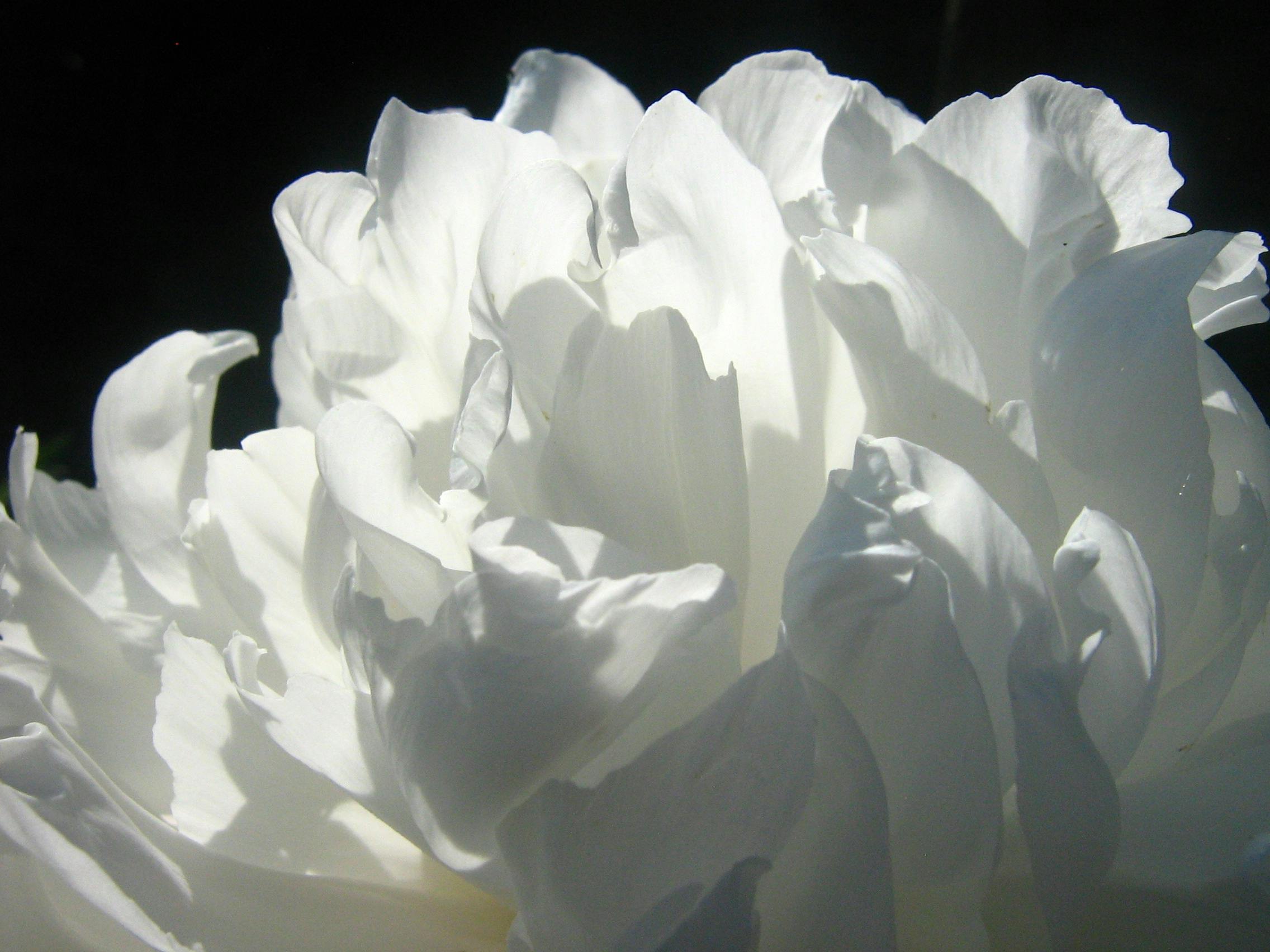
White.
I’m not even kidding, it’s literally just white. “Cloud dancer,” to be exact.
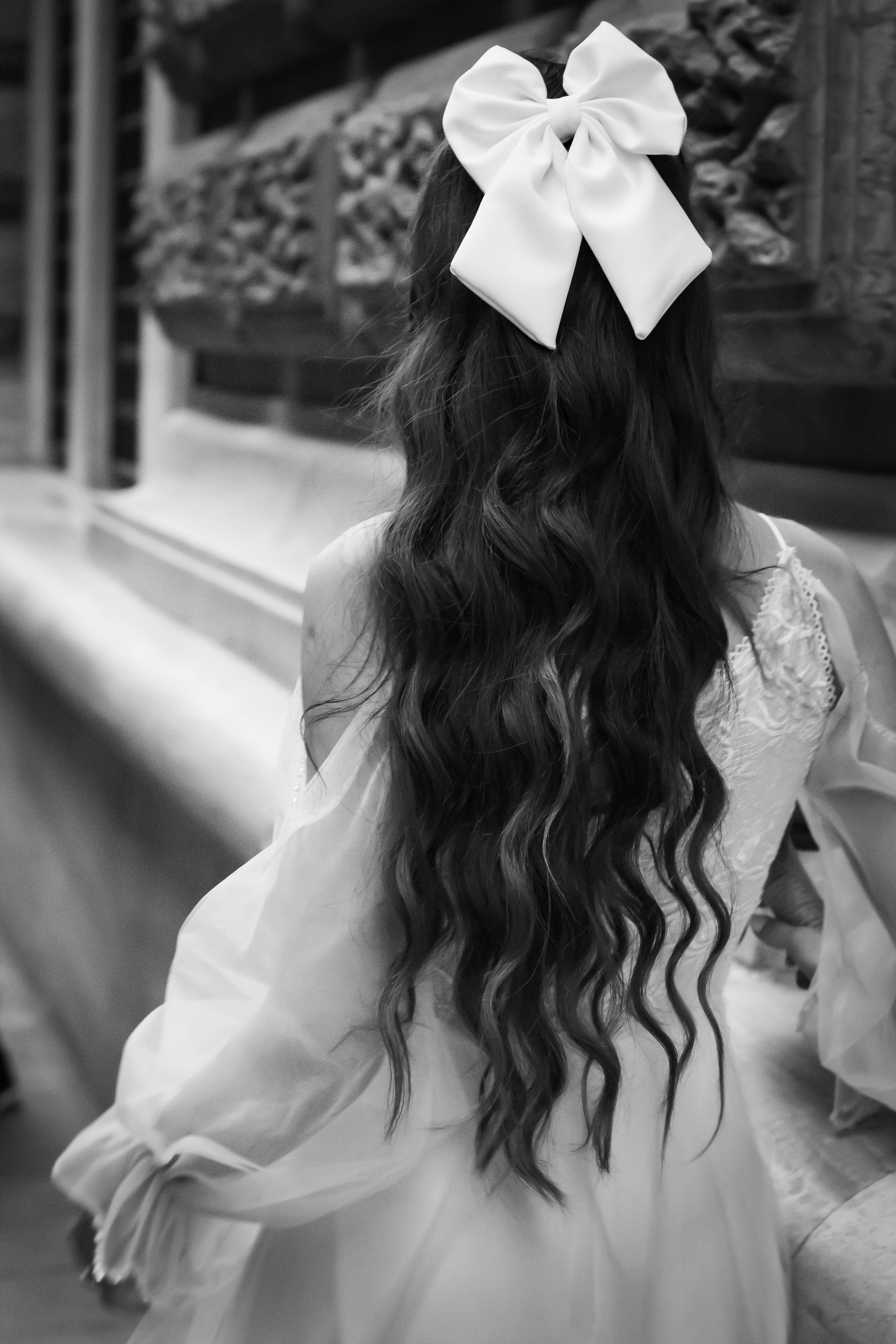
So, How Will Pantone 2026 Affect Fashion?

Image Credit: Esra saltürk from Pexels
- More white in collections: White and off-white will move from basic items to key fashion pieces like blazers, trousers, dresses, and matching sets.
- Focus on fit and fabric: Because white shows details clearly, designers will prioritize better cuts, textures, and construction over bold colors or prints.
- Fewer prints, cleaner designs: Expect simpler silhouettes, minimal patterns, and a strong emphasis on tailoring.
- Calmer store aesthetics: Fashion stores will use lighter displays, neutral styling, and minimal layouts to match the Cloud Dancer trend.
What Do People Think?

Image Credit: Pixabay from Pexels
The choice ended up dividing people by 2 groups.
Some people ended up HATING the chosen color, calling it boring, lazy, or the safest option Pantone could possibly make. To them, white felt like something you’d expect from a blank page, not a global trendsetter. After such fun colors like peach fuzz, greenery and viva magenta, it just felt uncreative and bland. Some people even worry it might be political. With everything going on around racial tensions lately, including controversy over a white supremacist–related jeans ad, choosing white as the Color of the Year feels insensitive to some people.
Others, however, defended the decision, arguing that “Cloud Dancer” represents a much-needed sense of balance after years of bold, overwhelming colors. In a world that feels increasingly loud and chaotic, they saw white not as empty, but as peaceful. Many also think it’s a great choice because it goes with everything. You can’t really go wrong with white. They also defend that it’s not political, since a black woman helped choose this color.
So now, everyone on the internet is fighting over it! And Pantone, as usual, has not directly responded to public criticism about white being associated with the 2026 palette either. Even though the number of people who dislike this choice is greater than those who are okay with it too!
My Personal Opinion

Image Credit: Ylanite Koppens from Pexels
Honestly, I think this choice is disappointing. I’m not sure if this choice really is political, because to me it makes sense but also feels like overthinking it too much at the same time.
But either way, l still find this choice really disappointing. The world feels like it’s slowly losing its color.
Everything used to be bold, artistic, and full of personality, but since minimalism became popular for being “practical,” a lot of that beauty has disappeared. Homes, fashion, and design now feel more functional than expressive.
I collect antiques for this exact reason. It’s been a hobby of mine for a while now. Everything from the past were colorful, detailed, and genuinely fun to look at. They were artistic. You can tell they have stories in them when you look at them. Choosing white as the Color of the Year only reinforces this shift, and to me, it proves how far we’ve moved away from art, creativity, and visual joy. White is just going to feed into minimalism more. It’s just sad at this point.
But of course, that’s just me. So, how do you feel about the chosen color of 2026?
