Forget playing it safe, the spring/summer fashion colour trends 2026 are all about embracing feel-good shades. While there are still some of the expected pastel shades associated with the warmer months, this season, designers have gone bold. Tory Burch sent models down the catwalk in bright blue macs, while Christian Dior and Burberry championed striking emerald shades. Sunshine yellows, fire-engine reds and confident chartreuse tones also made their presence felt, signalling a move towards colour designed to lift the mood.
“Spring/summer 26 is shaping up to be a season of feel-good colour,” explains personal stylist Lisa Talbot, highlighting how “uplifting brights, such as fresh greens, clear blues and vibrant purples” are being paired with “softer, romantic shades like blush pink, peach and buttery neutrals.” It’s optimistic fashion at its finest.
Elsewhere, neutrals played a quieter but no less important role. With Pantone announcing Cloud Dancer White as its Colour of the Year, there’s a growing appetite for softer shades that bring balance to a bolder palette. Taken together, these colours feel surprisingly versatile. Whether you’re refreshing a summer capsule wardrobe or tapping into jewellery trends 2026, this season’s palette is all about confidence, contrast and effortless style.
1. Sunshine Yellow
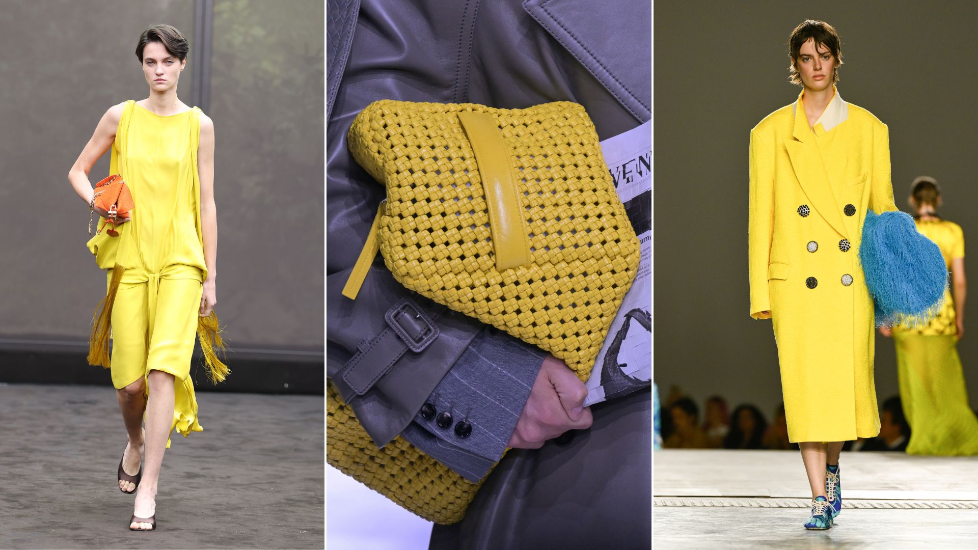
Louis Vuitton, Saint Laurent
(Image credit: Getty Images)
Sunshine yellow is set to be one of the brightest stars of spring/summer 2026. Tory Burch, Lanvin and Ferragamo all championed the shade on their runways, proving it’s a trend with serious staying power. And while pale yellow had its moment last year, this season’s iteration feels fresher and more energising.
“Yellows are going to continue to feature in SS26 but this time the soft butter yellows will make way for brighter lemon yellow giving a mood boosting dopamine hit,” explains Wendy Dooley, personal colour analyst and stylist.
Alyson Taggart, UK offer and publications director at Damart, agrees. “Flattering and easy to wear, this shade makes you think of sunshine and warmth, making it perfect for updating your wardrobe for the new season ahead,” she says.
The beauty of sunshine yellow is its versatility – and if you’ve already mastered how to wear butter yellow, you’ll find the brighter lemon iteration just as wearable.
“This is great in tactile finishes and fluid layering, paired with earthy tones such as tan and chocolate or with a fabulous orange shade which is set to be another trend next season, with everything from teracotta to a brighter citrusy shad,” says Wendy.
If the brightness feels a bit much, use it instead as an accent, suggests Wendy: “Try using it as a belt or bag to add a bit of playfulness and fun.”
2. Blush Pink
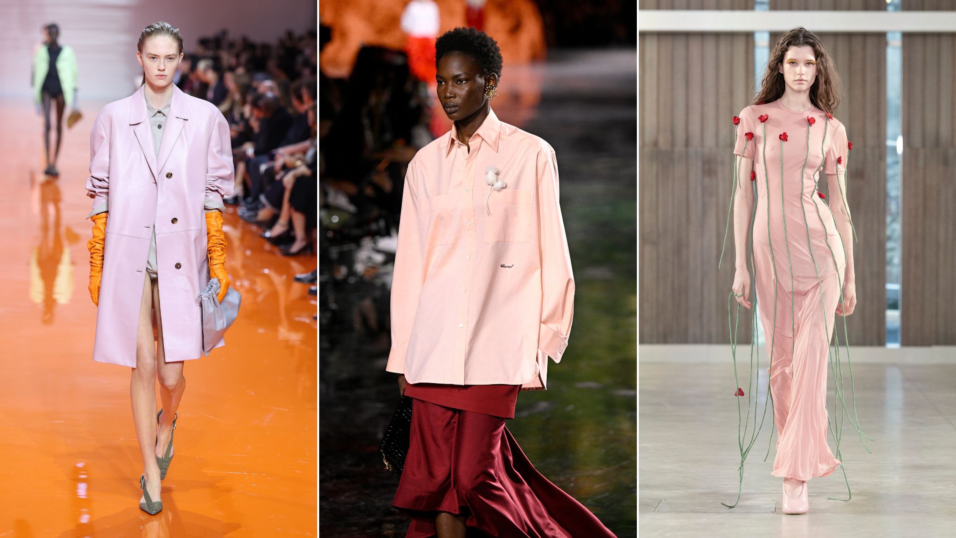
(Image credit: Getty Images)
“Blush pink is such a feminine shade,” says Wendy, and this spring it’s everywhere. Alyson calls soft pinks a “go-to” for the season, showing up in everything from knits to feminine jackets. The key is knowing how to style it.
Wendy suggests two approaches: pair it with “softly contrasting ice cream shades such as soft blues, greens, lilacs and yellows” for something gentle, or go tonal with “brighter or deeper shades such as magenta or burgundy to create a timelessly elegant” look. particularly in floral prints.
The easiest styling trick? Denim. “Opt for a lighter denim shade to keep that light, summery feel, or a darker denim to create contrast,” says Alyson.
While you normally have to ask yourself, ‘what colour suits me?’ when considering various fashion colour trends, the final good news about versatile pink is that it’s universally flattering. Lisa notes that “softer hues, blush pink, lavender, warm peach, give a gentle glow without feeling washed out,” making it particularly beautiful on midlife skin tones.
3. Cerulean Blue
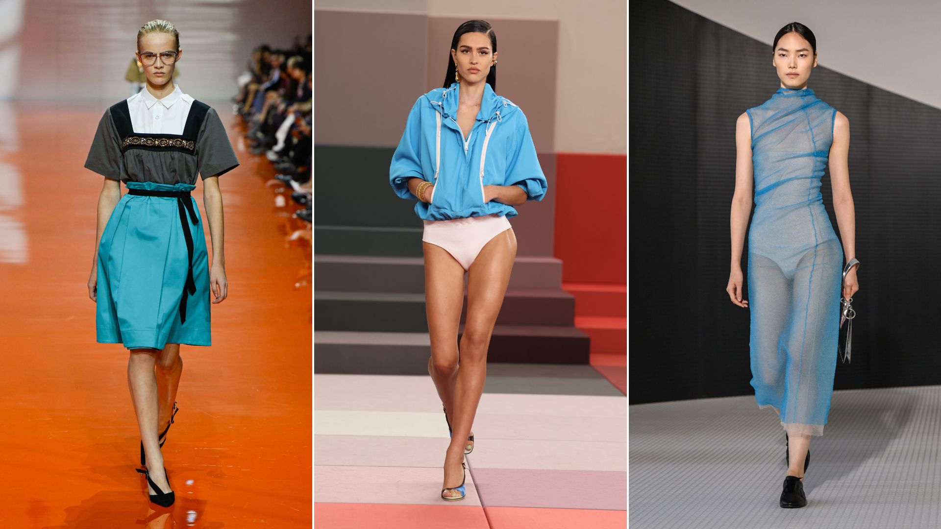
(Image credit: Getty Images)
Cerulean blue made waves at Fendi, Jil Sander and Prada, and it’s easy to understand why. The shade spans multiple tones, from turquoise to deeper blues, ensuring it’s flattering on everyone.
“For me, cerulean blue is reminiscent of the beautiful ever-changing shades of the Aegean Sea,” says Wendy. “This is a great colour for everyone, and it is fabulous worn in delicate fabrics such as satins and sheers which catch the light,” she explains.
For turquoise tones, Wendy suggests pairing with earthy neutrals such as tans, browns and soft gold, while cooler blue shades work best with navy and soft blue/greys.
Another reason why we’re excited about cerulean being one of the big spring/summer fashion colour trends 2026? It aligns perfectly with the launch of The Devil Wears Prada’s second film, a coincidence, but a fashionable one nonetheless.
4. Fire Engine Red
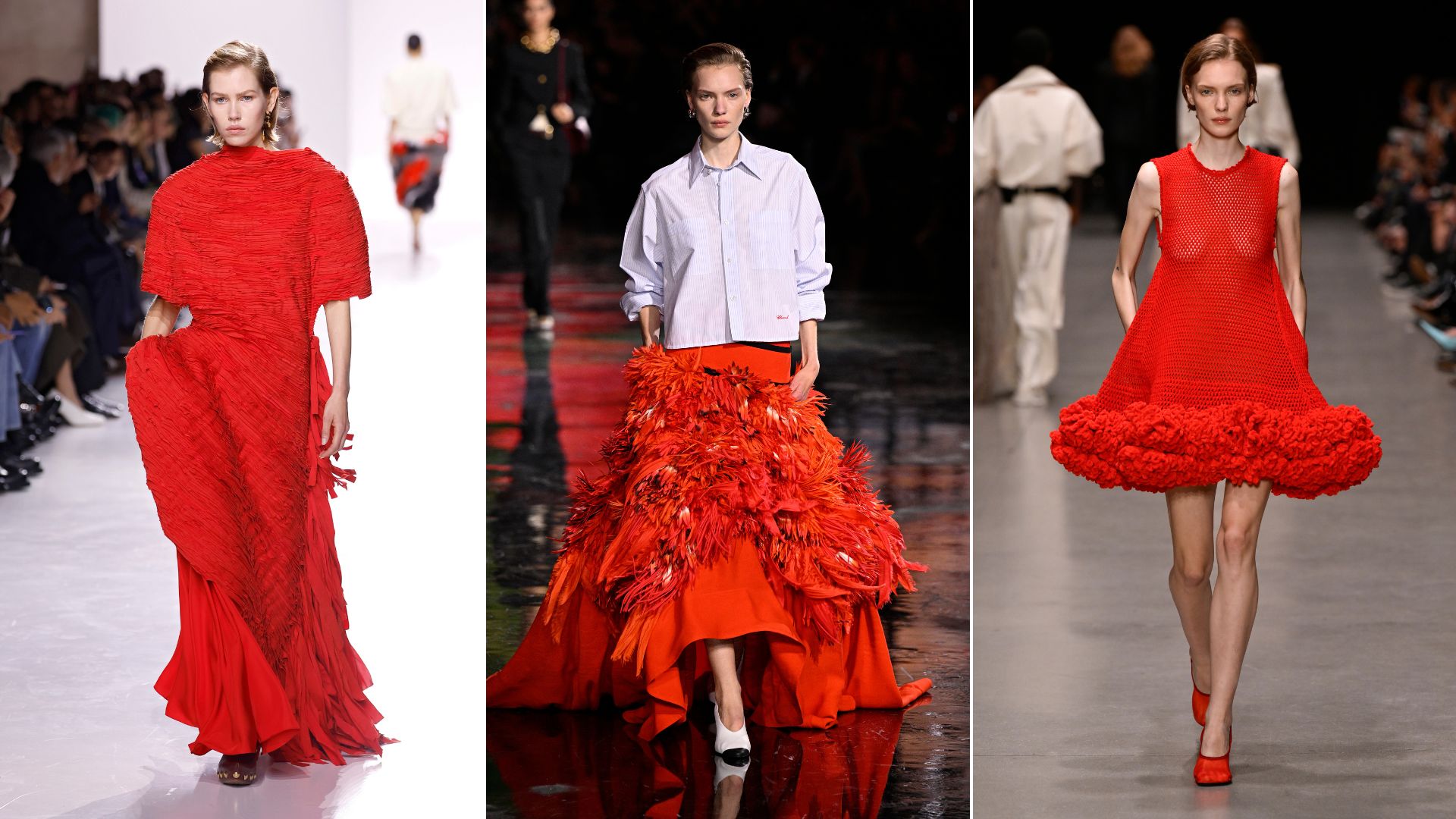
(Image credit: Getty Images)
Fire engine red is the ultimate confidence-boosting shade, and it stormed the catwalks at Chanel and Stella McCartney. It’s bold, it’s statement-making, and, according to Lisa, it doesn’t have to feel intimidating.
“Bold colours don’t have to feel scary, the trick is balance,” she says. “Pair a statement shade with simple silhouettes or grounding neutrals so the colour does the talking without overpowering you.”
If you’re nervous about diving in headfirst, Lisa suggests starting small.
“If you’re testing the waters, start with one bold piece, a blouse, a blazer, even a handbag and keep everything else stripped back. It looks intentional, modern and incredibly chic.”
Alyson predicts “red and pink will be the ultimate colour combination for adding pops of colour to your summer looks. Think floral prints and powdery pinks paired with bold reds.” Proof that fire engine red works just as beautifully softened with florals as it does on its own.
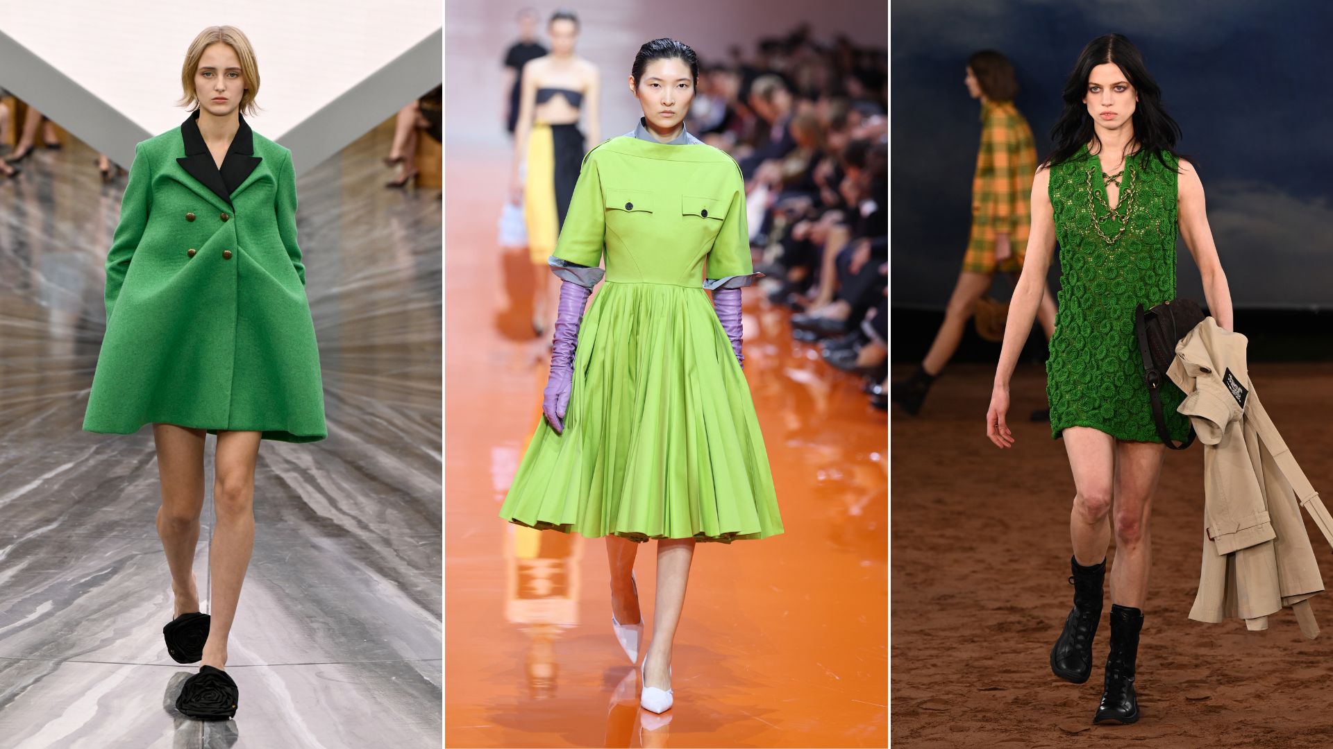
5. Feel-Good Greens
(Image credit: Getty Images)
Fresh greens are everywhere for this season and are a key part of the wider spring/summer fashion colour trends 2026, ranging from vibrant chartreuse to rich emerald tones.
“Jewel tones like emerald, sapphire and amethyst add instant radiance,” Lisa explains, making it a smart choice for everything from workwear to the best wedding guest dresses.
We’re already seeing some of the best British clothing brands, such as Hush and Boden, heavily featuring this soft shade as part of their new collections.
When it comes to styling, Wendy recommends pairing bright greens with contrast colours.
“Brighter and purer whites look striking with navy, charcoals, bright blues, cool reds and emerald greens,” she advises. If solid blocks of colour feel intimidating, there’s an easier entry point.
“Introducing prints such as florals or animal print can be an effortless way to introduce subtle colour without the need for bold blocks of a single shade,” says Alyson.
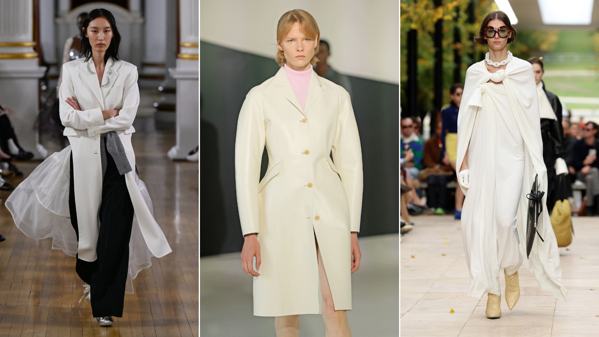
6. Cloud Dancer White
(Image credit: Getty Images)
Pantone’s Colour of the Year announcement sparked plenty of debate. Cloud Dancer White might not be the most thrilling choice, but there’s method behind it. Described as a “lofty white”, it’s meant to offer “space for creativity”, according to Laurie Pressman, Vice President of the Pantone Color Institute.
“This has been one of the biggest surprises of the Pantone colours yet and there’s no doubt that it will continue to influence the neutral trend that we’ve seen dominating for a few seasons now,” says Wendy.
She says that styling is key with this colour: “Warmer tones such as ivories and creams pair well with teals, chocolates and warm reds whereas brighter and purer whites look striking with navy, charcoals, bright blues, cool reds and emerald greens.”
White never really goes out of style, especially in spring/summer, and all-white outfits were everywhere from Simone Rocha to Jil Sander. Wendy suggests looking for white outfits in fabrics such as satin or bouclé to give a “soft, elegant vibe.”
For the simplest execution of this look, turn to white jeans outfits to seal the deal.
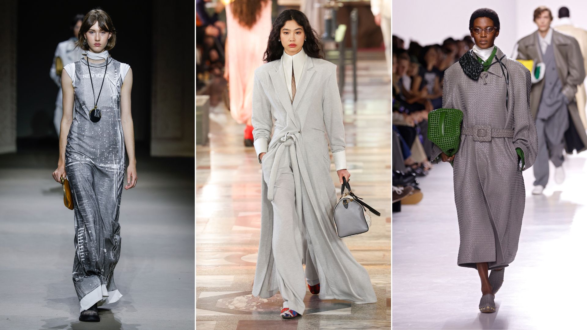
7. Summer Grey
(Image credit: Getty Images)
Grey is one colour that seems to come around each year, but normally in the cooler months. This season, however, the spring/summer catwalks were awash with this reserved shade. Louis Vuitton, Bottega Veneta and Coach were just some of the designers who incorporated grey into their summer looks, proving it’s not just for autumn/winter anymore.
The reason? It works beautifully with several of the season’s bolder shades – think sunshine yellow and blush pink – without competing for attention. It’s brilliant for pastel outfits too. It’s a sophisticated neutral that pairs effortlessly with multiple colour palettes.
Alyson notes that neutrals like “navy, white, cream, tan” are essential for styling pastels, and grey fits perfectly into this versatile lineup.
Whether you’re going for full-on monochrome or using it to ground brighter pieces, grey is quietly becoming summer’s most useful shade.
FAQ’s
What are the key spring/summer fashion colour trends 2026?
The spring/summer fashion colour trends 2026 are all about mood-boosting brights meeting softer romance. Sunshine yellow, fire engine red and fresh greens bring energy, while blush pink and cerulean blue offer something gentler. Pantone’s Cloud Dancer White provides a sophisticated neutral base, and grey proves it’s not just for winter. Whether you love bold colour or prefer pastels, this season has you covered.
Why do new colours come through each season?
“Colour is one of the quickest ways fashion can shift our mood,” says Lisa. “Each season brings a new palette because it reflects what we’re craving, whether that’s energy, calm, escapism or confidence. Fresh colours stop our wardrobes feeling stagnant and give us an easy way to evolve our style without starting from scratch.”
Essentially, new colours keep things feeling fresh without requiring a full wardrobe overhaul. It means you can quickly inject a trending style, and opt for new colours while sticking to silhouettes you know you love.
How can I introduce colour if I normally stick to neutrals?
Start small to build confidence.
“If you usually shy away from colour and stick to your trusted neutrals, then start small with pieces like accessories,” advises Alyson.
“It’s a wonderful way to introduce more colour into your wardrobe. A vibrant scarf or a bold handbag in a colour you love adds an instant pop to an otherwise all-neutral outfit, allowing you to experiment and discover your favourite shades without feeling overwhelmed.”
Will pastels be big again this spring/summer?
Yes, but with a twist. Pastels aren’t just being paired with other pastels anymore. It’s about creating unexpected, sophisticated combinations.
“People might stay away from darker colours in the warmer months, but pastels give an instant lift and work surprisingly well with shades like navy and burgundy,” says Alyson. “Working these different palettes will help elevate your look for a sophisticated feel.”
